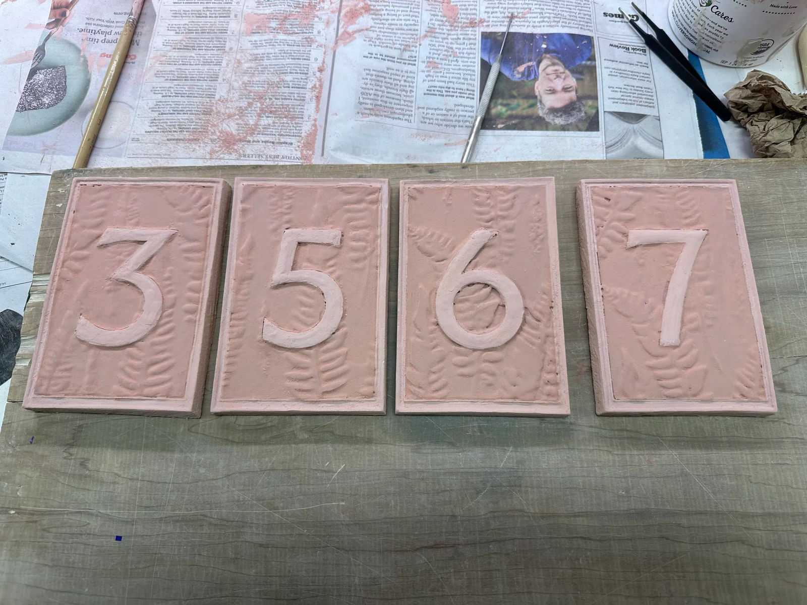
Ceramic table numbers
Making table numbers for our wedding was my first experience with hand building and mold making.
I wanted to make the table numbers for our wedding because I liked the idea of putting something personal into the reception. They would sit alongside the centerpieces, and I imagined people picking them up or asking about them over dinner. There was some self-expression in that, and probably a bit of ego too, but I was also interested in learning how to make them.
I was taking a pottery class at Ruby’s Clay Studio at the time. I’d taken one class before, but I’d only worked on the wheel, so both hand building and making molds were new to me. In retrospect, I bit off more than I could chew. I generally like projects like that because I learn a lot from them, though this one had to fit around the wedding.
Designing the molds
I realized I could use Claude to help design molds that I could 3D print and press clay into. The numbers and fern pattern would be recessed in the molds so that they came out raised on the tiles. Since I hadn’t made a mold before, a large part of the work was researching how deep and detailed those recesses could be while still allowing the clay to fill them and release cleanly.
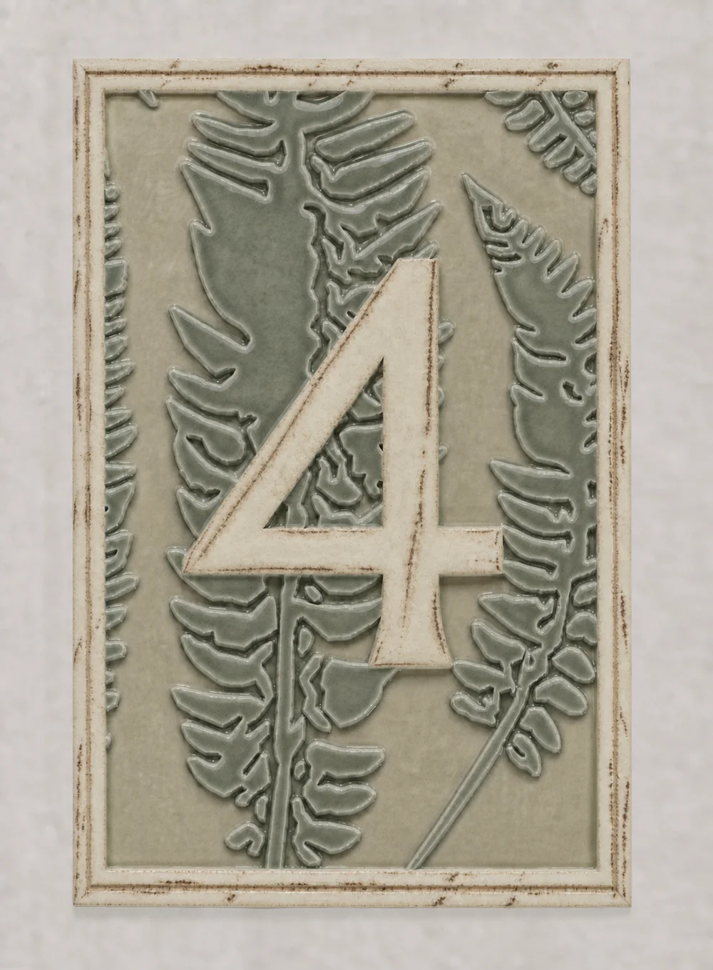
The centerpieces were planned as bowls of ferns, redwood sorrel, and moss, so I wanted the tiles to have a fern pattern as well. I chose licensed artwork and used Ashcroft Medium, the typeface from our wedding’s design guide, for the numbers. Claude wrote the code to turn those into printable molds, and I worked through the previews to adjust the proportions. We enlarged the ferns to make the finer details easier to reproduce in clay, with a different crop of the pattern on each tile.
The double border was based on a 1920s London tramways poster. We adjusted the spacing between the lines and brought the foliage up to the inner border to get closer to the reference.
Working in clay
I tested the process with one of the first molds I printed. Cornstarch worked well as a release agent on that first attempt, but cutting the tile out with a dough scraper distorted the edges. The tile also felt thicker than I expected when I held it, which led us to reduce the body from ten millimeters to eight.
To keep the thickness consistent, each mold had four corner stops. I laid a rolled slab of Soldate 60 clay over the mold and pressed it with a flat board until the board met the stops. That controlled the thickness after pressing, since the clay moved around enough that the slab roller setting alone wasn’t sufficient.
There was still quite a bit to learn about pressing them. My first set had shallow raised features because I wasn’t applying enough pressure, so the pattern didn’t have the contrast I wanted. I also had to get a feel for how much cornstarch to use. It was possible to use too much or too little, and getting a good release consistently took some trial and error.
I worked out a finishing process where I cut the tiles out roughly and then shaved the edges at the leather-hard stage, when the clay was firm enough to hold its shape. The cut edge needed to line up with the molded border. Shaving it back and briefly smoothing it gave the tiles the crisp outline I was looking for.
I printed all seven molds and made two of each number. After cleaning them up, I dried them flat and took them through bisque firing, the first firing before applying glaze. That part went well.
Choosing the glazes
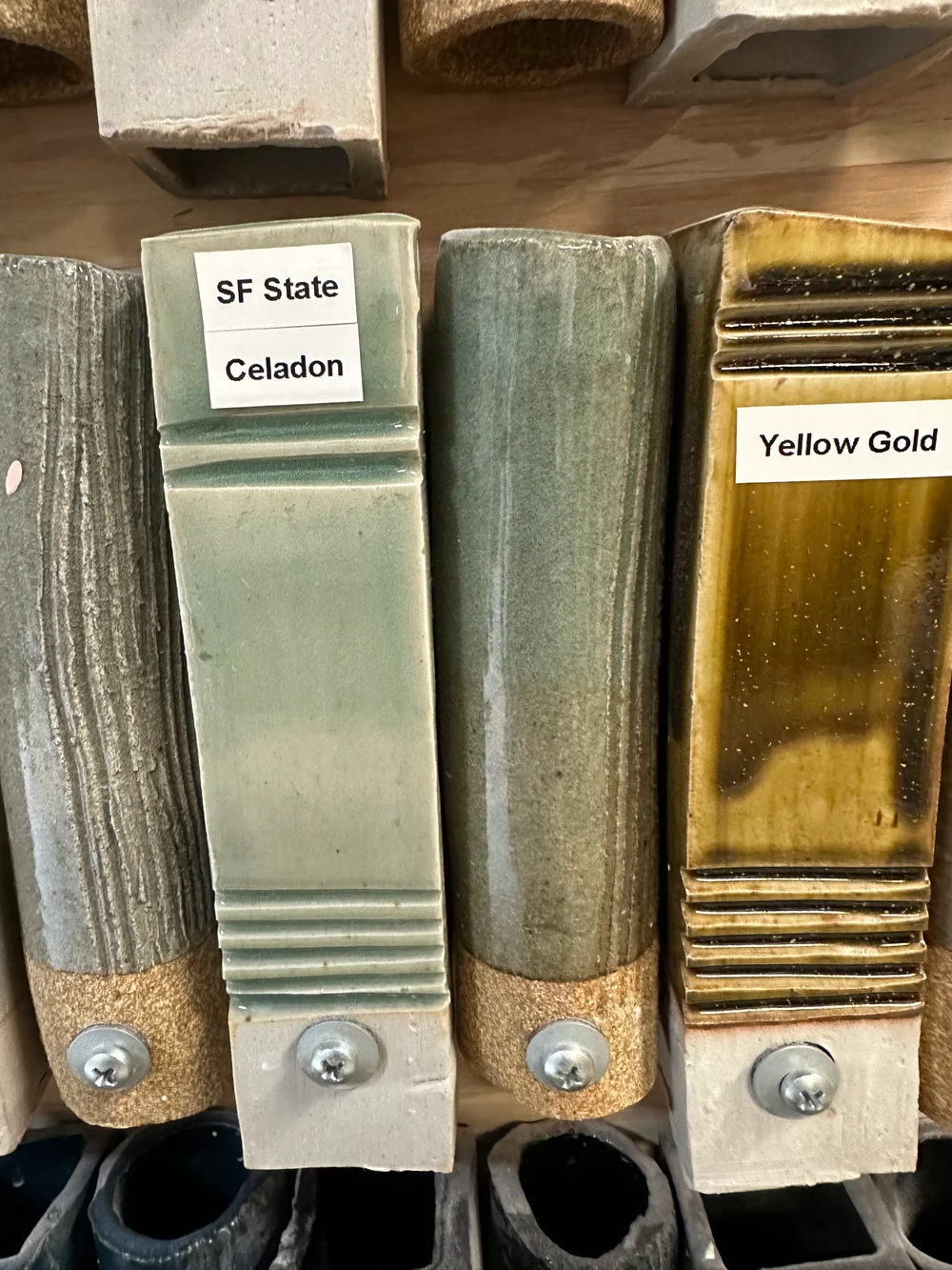
I originally wanted a green background with the number and border left as bare clay. Celadon was the only greenish glaze available to us, though, and the bare clay didn’t look good against it. Because of the time we had left, we were also planning to use the community electric kiln instead of the usual reduction firing.
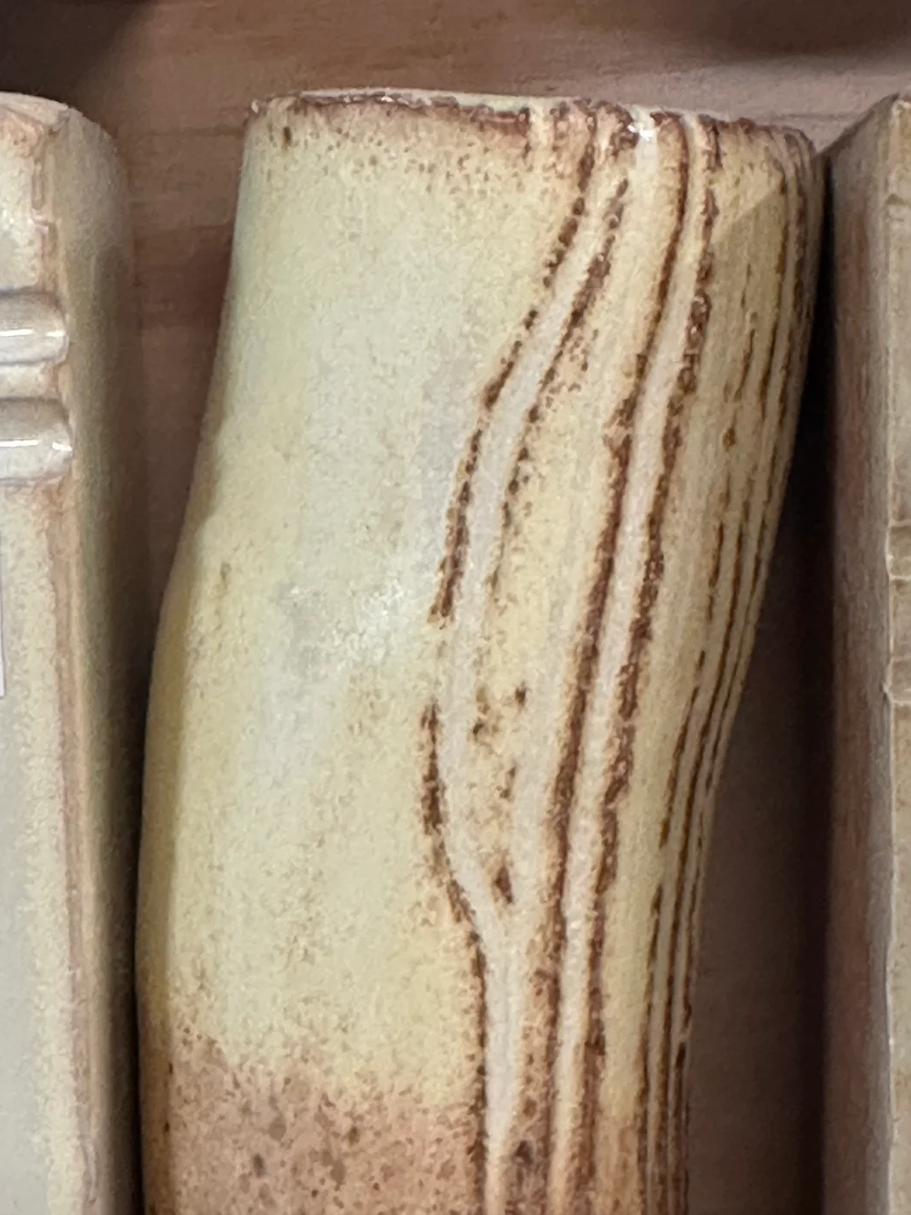
I used Codex to make mockups of different glaze combinations, supplying photos of the studio’s test tiles so the colors would be closer to the available glazes. We looked at underglazes and different numbers of celadon coats. I eventually chose yellow salt for the numbers and borders because I wanted them to be lighter against the green.
After the firing
The tiles came out much darker than I’d expected. The yellow salt was barely showing on the numbers, and the borders were almost entirely brown with only splotches of yellow. They’d lost most of the contrast I was hoping for between the numbers and the fern pattern.
I talked to someone afterward who explained that the yellow effect needs quite a thick layer of glaze, so I’d likely applied it too thinly. I think this was about five days before the wedding, which meant there wasn’t enough time to remake or reglaze them. We didn’t use them at the wedding. Luckily, I’d had backups printed on cardstock, and we used those instead.
I’m still considering reglazing the ceramic tiles, but I’d need to learn more about that process first.